

My_Home
My Home
My_Home
My Home
My Home is an integral part of Dignity Health, allowing users to connect to providers and securely view their medical records in an instant. The ability to book online, find care, and have a video visit instantly with a provider is revolutionary for the health care industry.
The application is available across all platforms including iPhone, Android and iPad. In 2017 it won the Best Healthcare Provider Mobile Application award from The Web Marketing Association. Read more about it here.
Leadership
Led a team of one Junior UX and one Mid-Level UX designer
My Role
Research, user interviews, user flows, information architecture, wireframes, prototyping, user testing, UI
The Team
Product Development Manager, UX/UI Team, Mobile Development Team, Quality Assurance Team
Platforms
Native iOS - iPhone, iPad
Native Android - mobile devices
Problem Statement
Dignity Health patients needed a way to find a provider, schedule an appointment, get directions to a facility, access their medical records as well as pay their medical bills. Since this was a patient facing app, it needed to be AA ADA compliant so extra attention was needed for colors, text size, iconography and the ability for screen readers to be able to correctly read each screen. The majority of users were not very familiar with technology and mobile apps so user flows had to be intuitive and trust had to be built especially since the application contains their personal medical information.
Application Site Map
When creating the flow of the app, we kept in mind the major features and tried to keep them all grouped together in an intuitive way so the user can quickly find what they are looking for and easily accomplish their task. The road map also included many features, so we also had to design a site map that would allow for that scalability.
Make an appointment user flow
Below is an example of a user flow in the application of how to find a provider, then create an appointment with them.

Wireframes
Wireframes
When creating the wireframes, I made them easy to read for the client and development by using the blue to indicate an actionable element. To understand the flow of the app and for user testing, I created a clickable prototype. Each element on the screens were annotated to hand off to development for guidance.
Wireframes
Wireframes
When creating the wireframes, I made them easy to read for the client and development by using the blue to indicate an actionable element. To understand the flow of the app and for user testing, I created a clickable prototype. Each element on the screens were annotated to hand off to development for guidance.
Challenges
The client wanted to use custom design components instead of using native iOS and Android components. This created a need for a custom component library as well as an extra lift on development and quality assurance. Since the iOS and Android platforms work differently, it was also a challenge to make the two platforms look and have the same experience as possible. There was also limited time for designs and builds which created a challenge of design and engineering working in tandem. Since design was not out ahead of engineering enough, there ended up being rework for both teams. The app needed to be AA ADA compliant so I needed to make sure the colors were the correct ratio as well as laying out the design for voice over to be able to accurately read the screen.

UI Design
UI Design
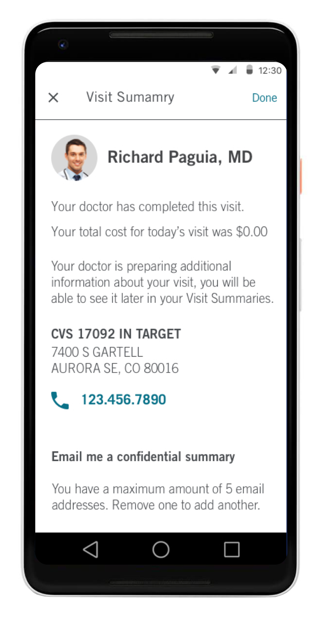
The final design had a seamless user flow across all platforms and created a simple experience for the user to schedule appointments, view appointments, view medical records, start a video visit and more. It was also a custom design that was uniform across the iOS and Android platforms. It also met all requirements to be AA ADA compliant.
UI Design
UI Design
The final design had a seamless user flow across all platforms and created a simple experience for the user to schedule appointments, view appointments, view medical records, start a video visit and more. It was also a custom design that was uniform across the iOS and Android platforms. It also met all requirements to be AA ADA compliant.
Outcomes & Learnings
Having custom components created some difficulty for design and development with platform updates. We also learned that we needed to conduct user testing sooner in the UX process to validate our assumptions and users needs. Since it was such a tight timeline the design team could have been working ahead on features in tandem which would give us more time for research and testing since the roadmap was clearly defined.


